The design look fresh. Just reconsider the colour for your main navigation button-whites seems a bit unattractive AND blended to background. 2nd suggestion is may rephrase your title to punchy words such as Le Mon, Love lEmOn...etc
Thank You for comment,I got comment from my friend that said the first gray layout is better than second yellow layout. Thinking how to modify it... ^^
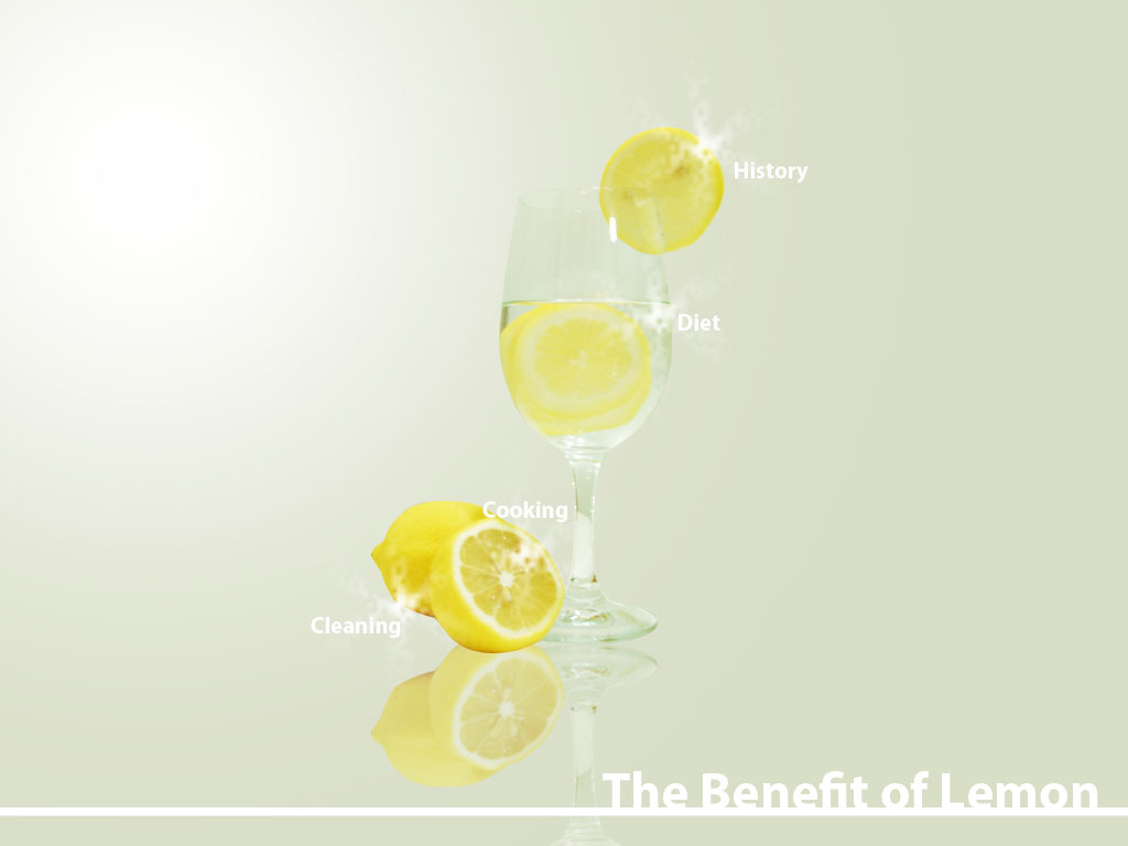
The design look fresh. Just reconsider the colour for your main navigation button-whites seems a bit unattractive AND blended to background.
ReplyDelete2nd suggestion is may rephrase your title to punchy words such as Le Mon, Love lEmOn...etc
wah... geng design... so clean ... XD
ReplyDeleteThank You for comment,I got comment from my friend that said the first gray layout is better than second yellow layout. Thinking how to modify it... ^^
ReplyDeletelike the grey one
ReplyDelete